Calling Dr Jones
|
In the dense jungle that is Seiko watch options, this is one that would probably be located near the golden statue but before the pressure sensitive wall arrows, to speak in Indiana Jones terms. It’s half way between the slightly cheaper Prospect/Cocktail times of the Seiko options and the new premium offerings. So would you be happy, figuratively speaking, picking up a silver idol with a fancy blue ring and perhaps not risk being chased out of the cave by a giant, stone ball (debt)?
I came across this at an Australian online only watch dealer and it got me interested. As far as nicknames go, this is a pretty ordinary one in my opinion. Seiko watches have all the best nicknames drawn from a rich culture and whilst I get the connection to the tough as nails Marinemaster, this to me deserves to stand on its own..ahem..crown. |
But where exactly does it fit in the Seiko world?
I kept an eye on it for ages, struggling to justify the cost over my other Seiko models and a couple of German watches I was also looking at. I came across it in stock in a small Victorian town and I found it at the time a bit too blingy for me. So, in the end, the Germans won and I eventually removed it from my shortlist. A few months later, my friend John bought one and started posting images of it and my eyes took on a slightly green tint. Luckily for me, John lent it to me and I’ve been able to experience ownership over the last few weeks. |
My impressions after a few months of owning & wearing the watch
|
I had the option of borrowing the packaging also but honestly, this is the usual dead boring white plain box with blue plain manual yawn fest.
Why is it that even around the $1000 mark you get the first impression of a watch at $50? It’s such a shame and if you’ve bought any other watches around this mark, you’d definitely feel a bit glum. Anyway, plenty of people feel that if the effort is put into the watch instead, it doesn’t matter. So is it? |
|
|
Holding it for the first time and attaching it to the wrist, first impressions is a pleasing weight and feel to the watch. Also, it’s a slightly confusing mix of colours and complications initially. My mum used to say that black and blue shall never mix. That’s always stuck by me, especially as I frequently break this rule.
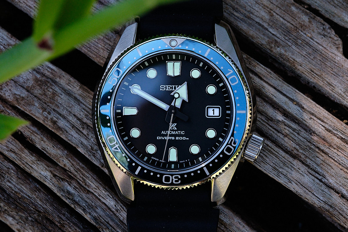
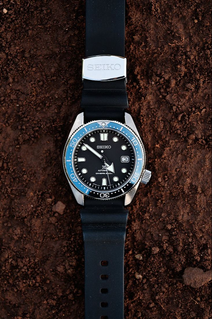
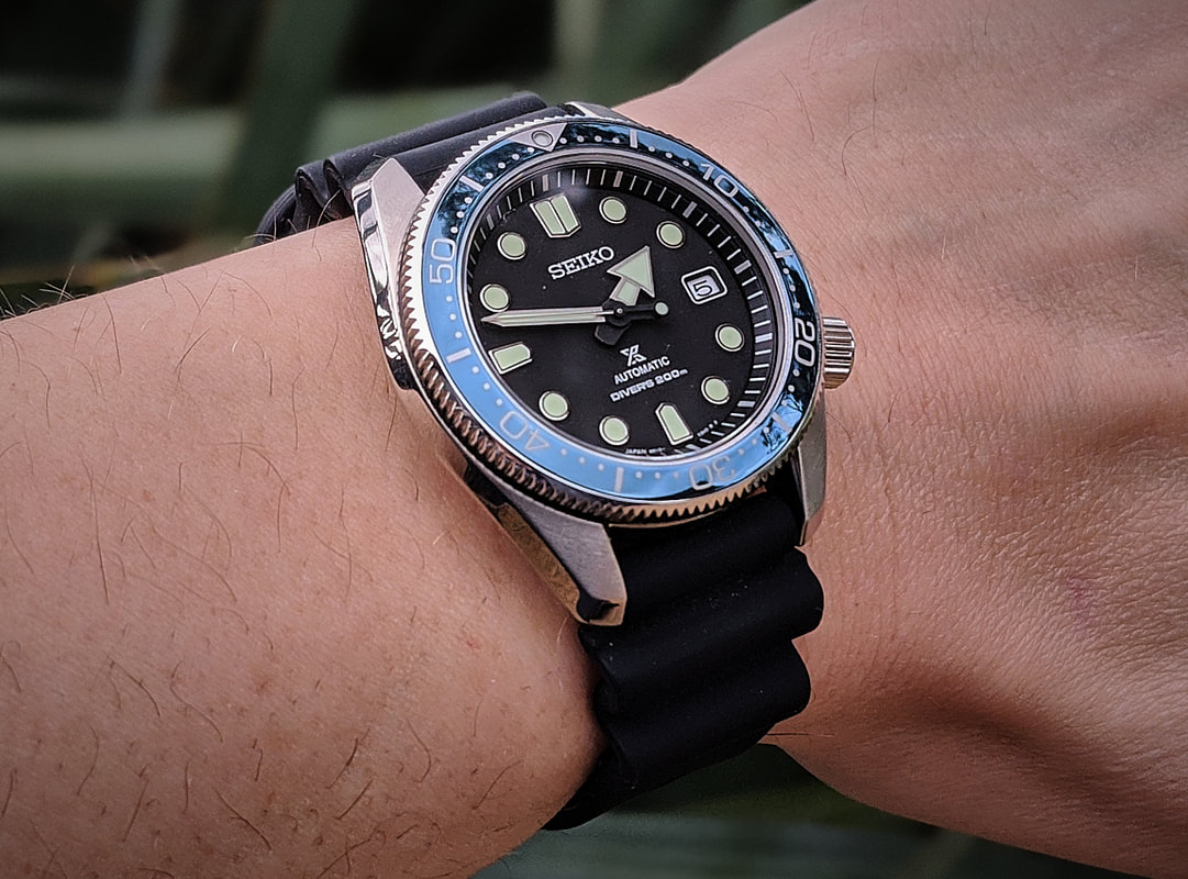
This watch has a matt black dial, a shiny blue bezel, greenish indices with thick lume and a white date window. On paper, this is a mess. In person it’s actually quite beautiful. My wife approved of this one immediately and that’s rare. John bought this on the black rubber strap, more on this later. |
|
|
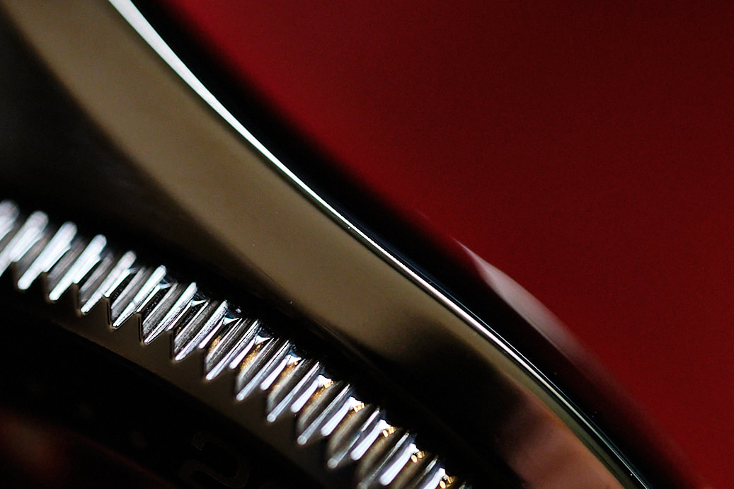
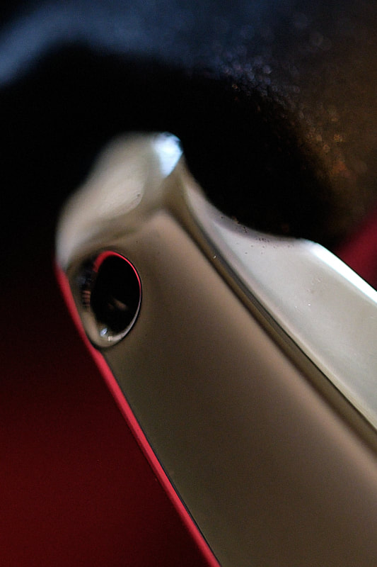
Let’s look at the case of the watch. It’s an intriguing mix of brushed and high polish surfaces. There’s a steep angle inwards towards the wrist that has the effect of making the case look much smaller than what it is and it’s also very pleasing to run your fingers across. It looks so sleek from above, the side and directly from the back.
The long beautiful lugs is what caught my eye in the first place. Since this watch is not attached to a bracelet, they are enhanced sticking out on their own like this and the polished edge that runs along the side of the case stretches all the way to the edges. It’s a great effect. There are so many small details on the case of the watch that comes alive the more you look at them. This attention to little details is for me what Seiko does best on their case designs. |
|
|
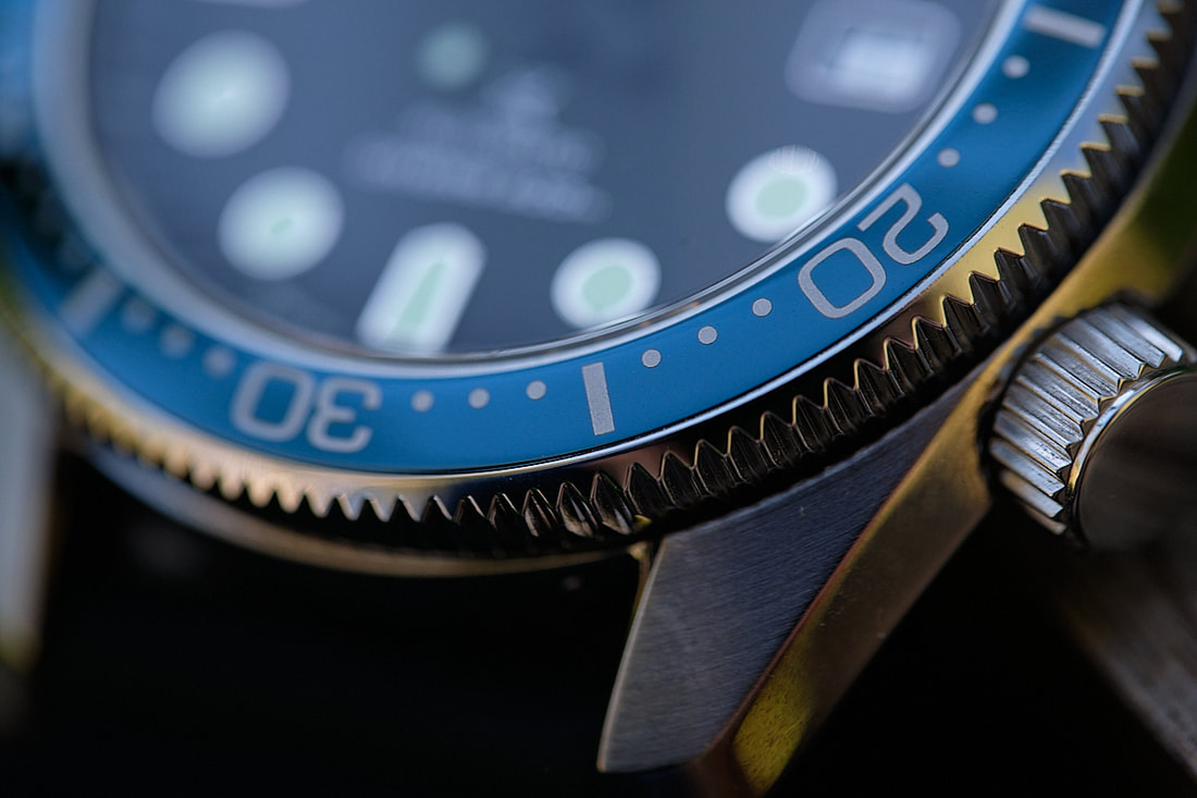
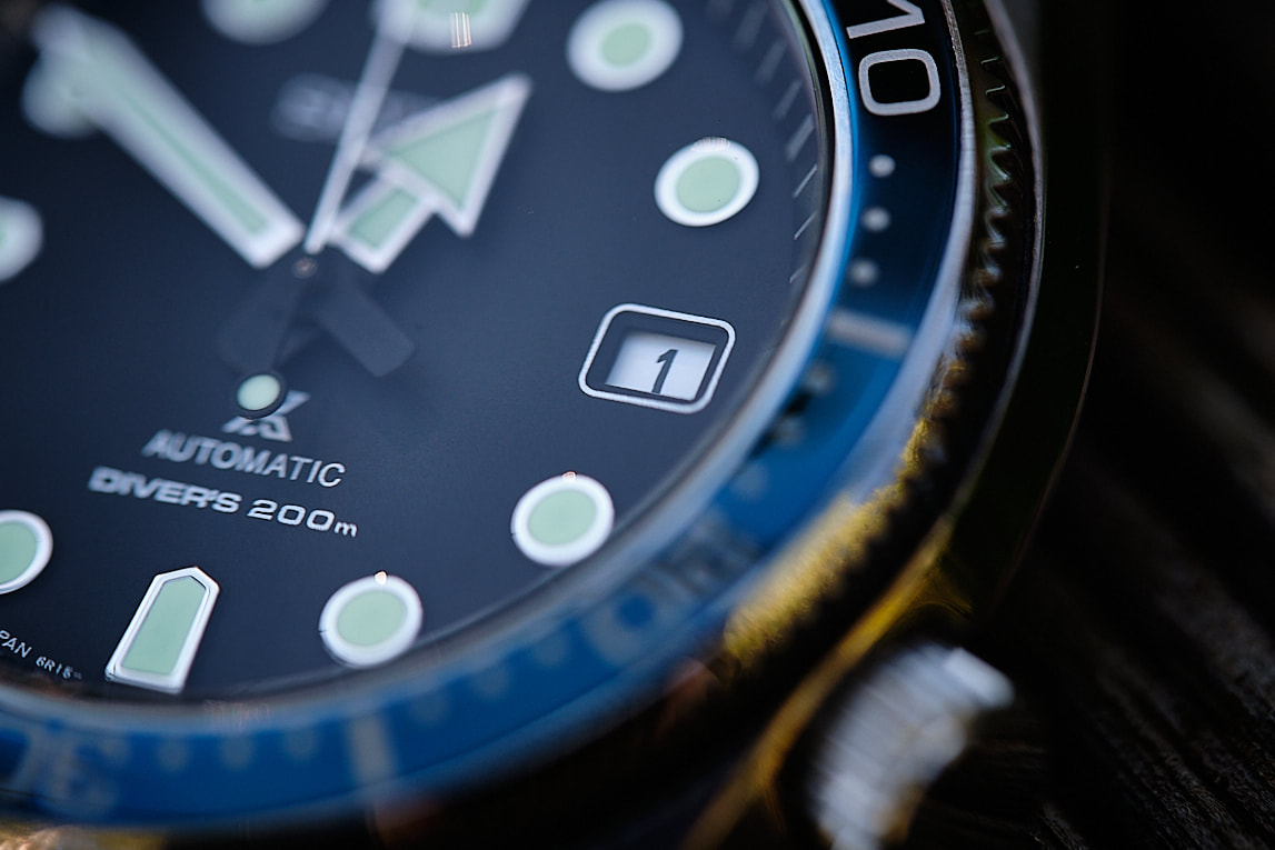
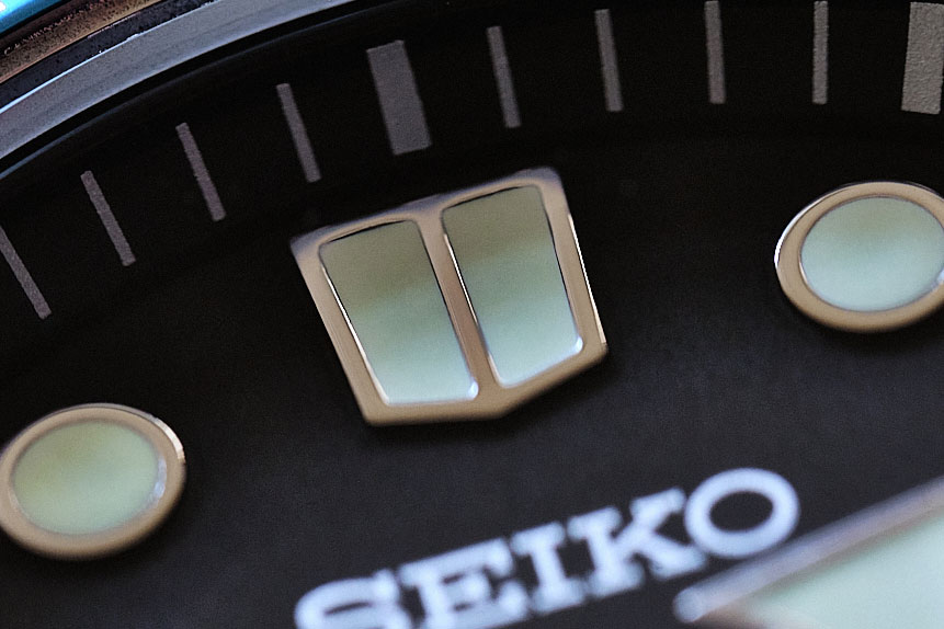
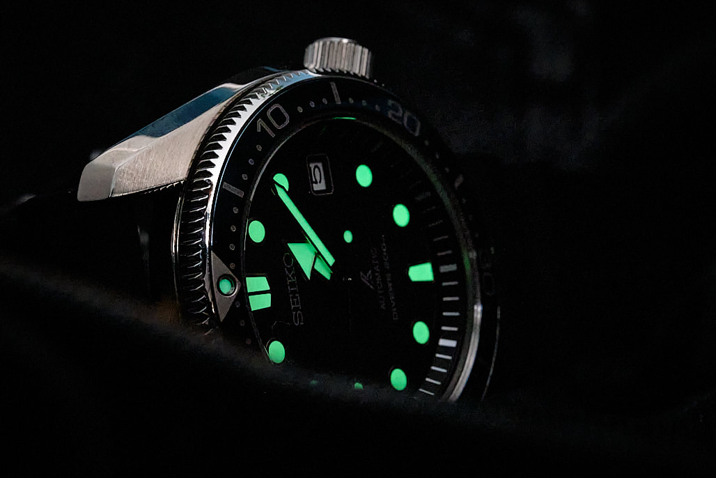
On to the dial of the watch. It’s strong. We have large, applied indices that you can tell even in daylight, will light up like a torch at night. The green-ish tint, framed by silver coloured metal on the indices and hands make this an absolute case study in legibility. The broad arrow on the hour hand and the long sword minute hand are distinct details, they will never be confused with each other. There is a small lumed lollipop counterweight on the seconds hand. I’ve read reviews expressing that this detail means that when you look at the watch at night, you’re always having to add 30 seconds in your head. This made my eyes roll back quite far into my head.
Speaking of eye rolls, there are no bezel alignment issues here but there is in fact a small alignment issue with the 12 o’clock indices and the minute markers. These are not visible at a casual glance, you have to bust out the loupe and/or the macro lens. Whilst that is nit-picking, I feel Seiko really should pay as much attention to things like this as what they do with their case designs. |
|
|
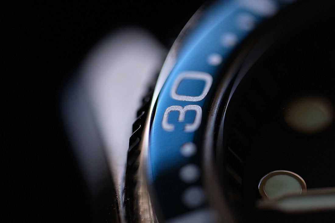
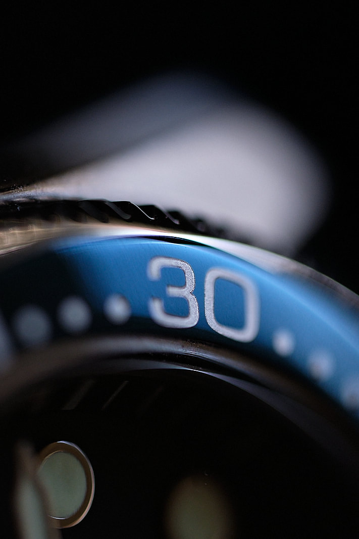
The date window is black text on white. I’d have preferred white on black but that is matter of taste, you could argue that black on white helps with legibility. So, that bezel. It’s simply stunning. It’s the colour of blue that you see in tropical waters, that shade that exists between the green water close to the beach and the deep blue.
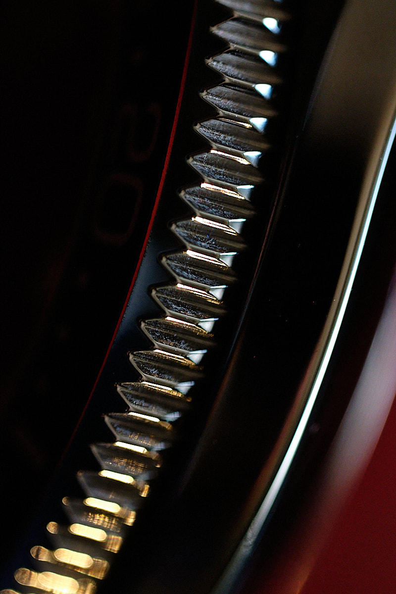
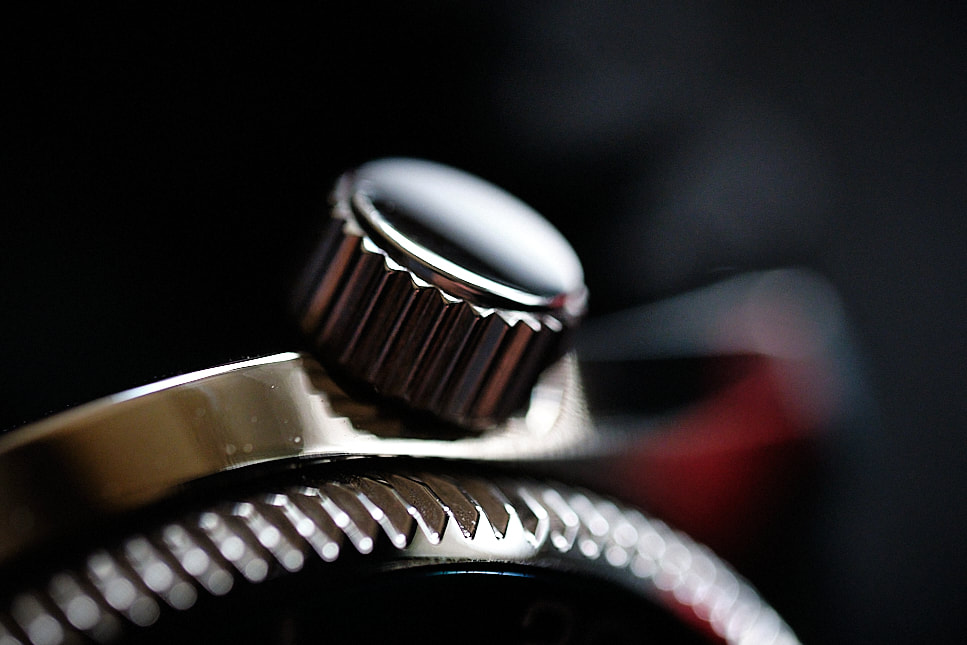
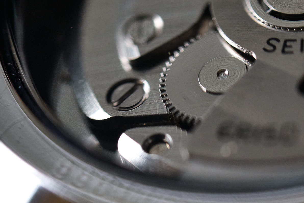
It’s a high polish bezel and it catches the light all day long. It’s quite addictive to photograph because it’s just such a lovely shade of blue. The coin edge is reasonably easy to grip and the 120 click bezel action feels like all other Seikos. Not bad but the usual ratchety affair. I don’t mind this at all, the only time I play with the bezel is watching TV on the couch and I’ll never time a dive with this. So as a replacement for a fidget spinner, it’s fine. The crown, I do want to instigate my own eye roll moment here. I love the 4 o’clock position, it makes so much sense since it doesn’t dig into your wrist regardless if you wear your watch on the right or left hand. I think the oversized crown is a great detail and it’s very easy to grip. Two things though. Unscrewing the crown, there’s a fairly gritty feel just as it’s about to pop. It’s fine, but it does feel like something is mixed in with the thread. No biggie, when it’s unscrewed it’s a very free flowing movement this one. But, why in the name of Emperor Taishō is it not signed? A blank polished crown just shouldn’t happen at this price point in my opinion. Sure, you know you’ve got a Seiko on your wrist but it’s no less important of a detail than the stunning polished case. Ok, you can re-adjust your eyes to the forward seeing position now. |
|
|
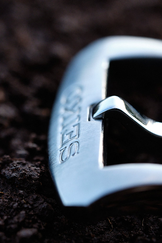
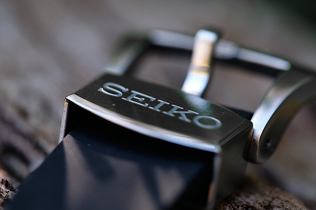
On to the rubber strap. The blue model only comes on this strap, the black one is available on bracelet. Seiko rubber straps are super comfortable and look pretty great as well on wrist. You won’t feel like a wanna be surfer/diver wearing this. It fits the watch and the thick buckle and floating metal bar (both SEIKO signed..ahem) are solid and oozes quality. Again, wearing this on a rubber strap accentuates those beautiful lugs and I love that. I’ve seen pictures of this on a light blue Erika MN strap and that also looked fantastic. People have this aversion to wearing leather straps on dive watches, understandable and all, but I can see a variety of leather straps fitting this watch.
|
|
|
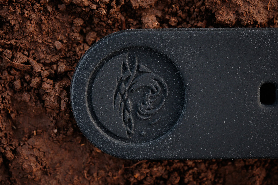
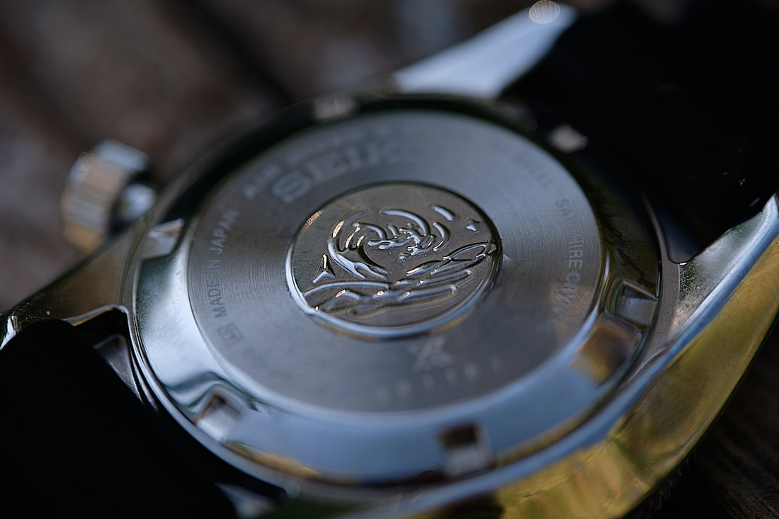
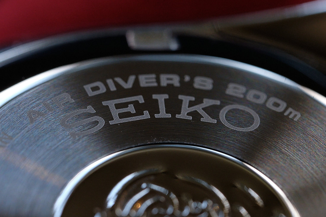
Flipping the watch over, there are the usual details, made in Japan etc. It’s an industrial feel which I love and there is the Tsunami logo what adorns most of the Prospex watches. I think this detail is a lovely Seiko tradition.
For better or worse, tsunamis are something that Japan will forever be associated with. The back of the watch looks like it could be from 2020 or 1960. I love it. Finally the lume. This is a bit of a Seiko trademark since they absolutely lead the market here. It’s amazingly bright when fully charged and lasts all night long. The indices, hands and counterweight on the seconds hand have well applied lume, the date window has none. The lume pip on the bezel also lasts reasonably well. You’d have no problems seeing this under water, in the cinema or wherever your nightly travels take you. |
Movement
Strap & Bracelet
Case
miscellaneous
|
Final Words
|
Seiko can always be relied upon for great dive watches and let’s not forget that they make all their inhouse movements and own lume solution, you’d pay premium for this with other brands. When I think of Seiko, I immediately think of a dial like this one. I think you could call it the quintessential Seiko design.
So where does this model fit in the scheme of things? I have a feeling that this mid-range that is occupied by this watch and the SARX/SARBs will eventually go away and we’ll simply have the good value 5’s & Presage models and then all the premium models. You can’t blame Seiko for this, every company ever in the history of time forever strive towards increasing profits and it’s not hard to argue that their premium watches easily stand up to the best from Switzerland & Germany. The SPB079 is already becoming harder to source so it will be interesting to see what’s going to replace it. In my opinion, this is about as dressy as a dive watch can be and you could easily wear it in any situation. It would signal that you go open ocean swimming to your fellow office workers and it’d help strike up conversation if your day job includes folding t-shirts at Uniqlo. It feels great on the wrist and you’ll prove to the world that black and blue does in fact mix. So pick this up, exit the cave in a leisurely fashion, strike up conversation with the peaceful Kikuyu on your way to the plane and fly off into the sunset with a smile on your dial. Cheers, Esbjorn |
19 cm wrist
|
Did you enjoy this review? Coffee fuels my night time ponderings.