The low maintenance sister
|
Tudor has had an interesting journey. Always well respected but also forever in the shadow of its big sister, Rolex. In my opinion, there were not a lot of reasons to go Tudor over Rolex back in the day apart from the obvious being price. Tudor did have some lovely models like their own Submariner and special editions shadowing some other Rolex models.
This changed profoundly in 2012 with Tudor’s launch of the Black Bay collection. A direct descendant of Tudor’s own submariner that was first launched in 1954. The launch created ripples in the watch community and the Black Bay became a must own for any collector. The vintage colour schemes, the return of the snowflake hour hand and just the fantastic, stylish watches at a (relatively) affordable price….the younger sister got all of the attention all of a sudden. Eventually we’d get GMT models, more colour schemes and even some rather bold experimental projects like the Black Bay P01. |
So here we had an affordable and extremely attractive Rolex Submariner alternative. Was it perfect? Pretty much. It’s a super attractive watch but the early models had an ETA movement to keep costs down which some frowned upon. Latter models received an inhouse movement but this also meant that the watch became much thicker (happens to all of us with age).
I kept admiring the watch from a distance and eventually, the Black Bay 36 was launched and what a stunner it is. Stunning, but too small for me. Enter the Black Bay 41 and I was sold. Here’s a watch that works in every scenario. It retains all the beautiful design cues originally launched in 2012 with no rotating dive bezel. Perfect, I have enough diver’s watches. Initiate saving mode. |
My impressions owning & wearing the watch.
|
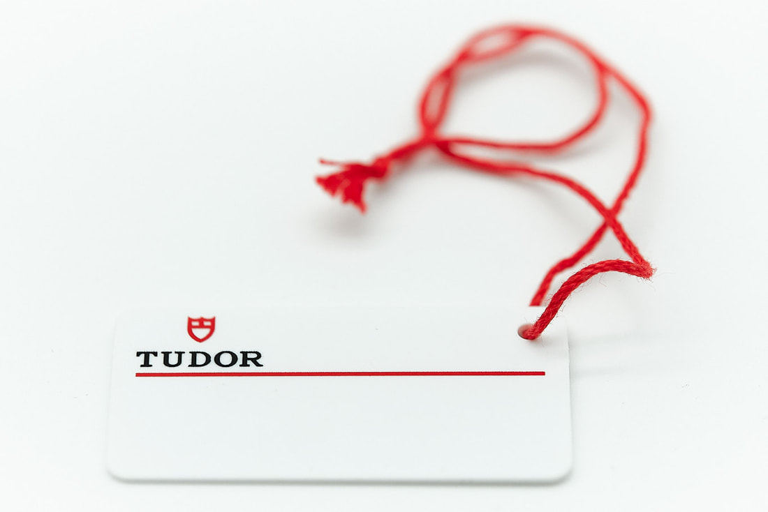
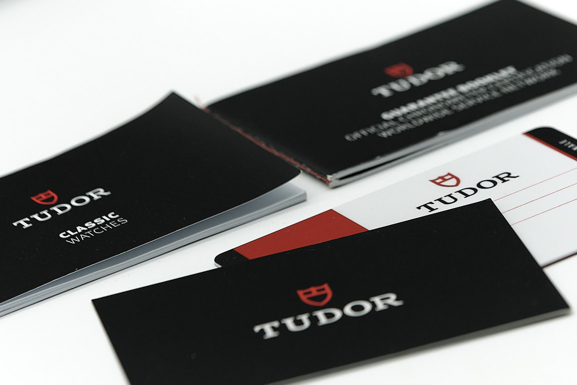
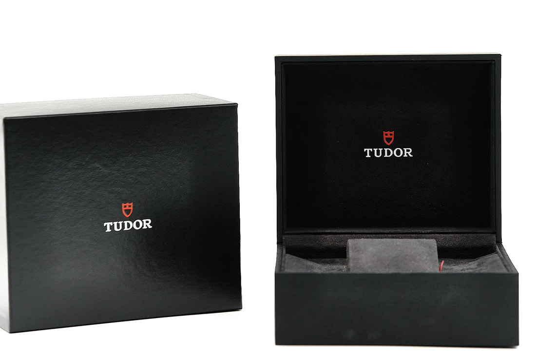
First, packaging. This is my first real luxury watch and it starts with how the watch is presented. I bought it second hand but everything was kept as new. I love the sturdy box and the classy deep black. Opening the box, the ‘secret’ compartments that house the extra links and swing tags is a lovely touch.
There is the constant debate about packaging in the watch community, what is the point of it when it’s just going in a cupboard etc. However, buying and selling watches, the difference in price when box and papers are included speaks for itself. Also, to me it shows great attention to detail and help form your overall first impression of a watch. |
|

|
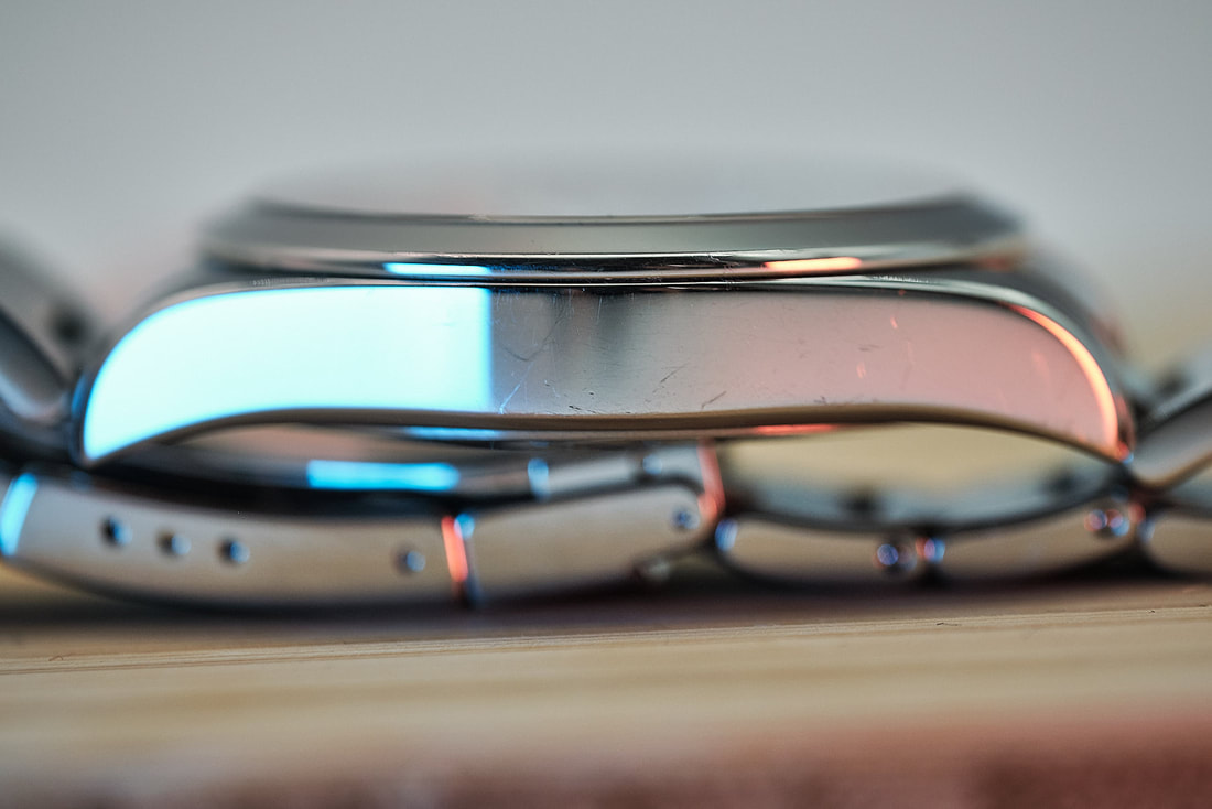
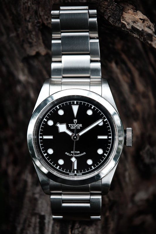
Let’s talk about the case first. Having handled a few Rolex watches in the past, to me this case absolutely stands up to any luxury brand. The steel used and polishing, feels almost magic to the touch. It’s so soft and it’s almost like you’re not handling steel but some sort of velvety skin/steel alloy.
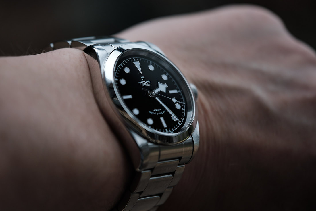
The overall design is similar to the Oyster Perpetual Rolex design and that can only be a good thing. There is not a single sharp edge anywhere, it’s simply excellent. Perhaps this is a good time to also discuss my early comment on the latter releases being quite thick. This particular model has an ETA movement which helps keep the case thin at only 11.2m. This suits the design so well. It is a fairly large watch, larger than what many watch fans would argue be acceptable for a dress watch. For me though with my larger wrists, it fits absolutely perfectly and the thinness of the case means the BB41 easy slips under a shirt sleeve. I will eventually wear shirts again post Covid I hope (there’s something I never thought I’d write). |
|
|
The watch is 50mm long. The lug design dramatically curve down which helps again making a large watch wear small. The bracelet and end links are also perfectly integrated with the lugs, and in fact the bracelet is a huge selling point here, more on that later.
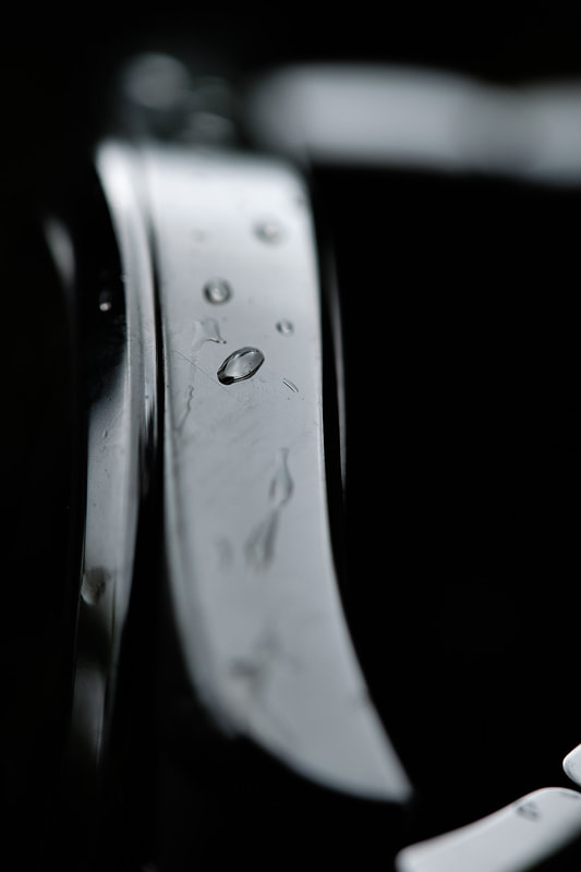
Again, the steel feels so soft to the touch with its high polish. It is also very susceptible to scratches due to this so it's something you have to live with. |
|
|
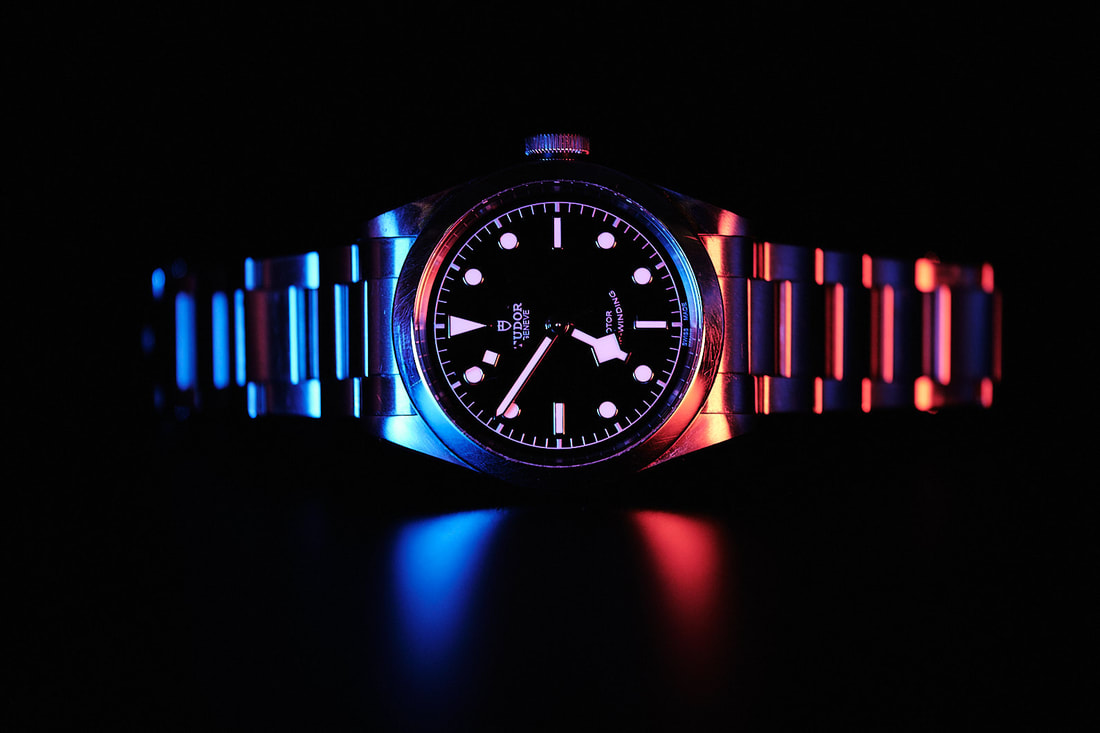
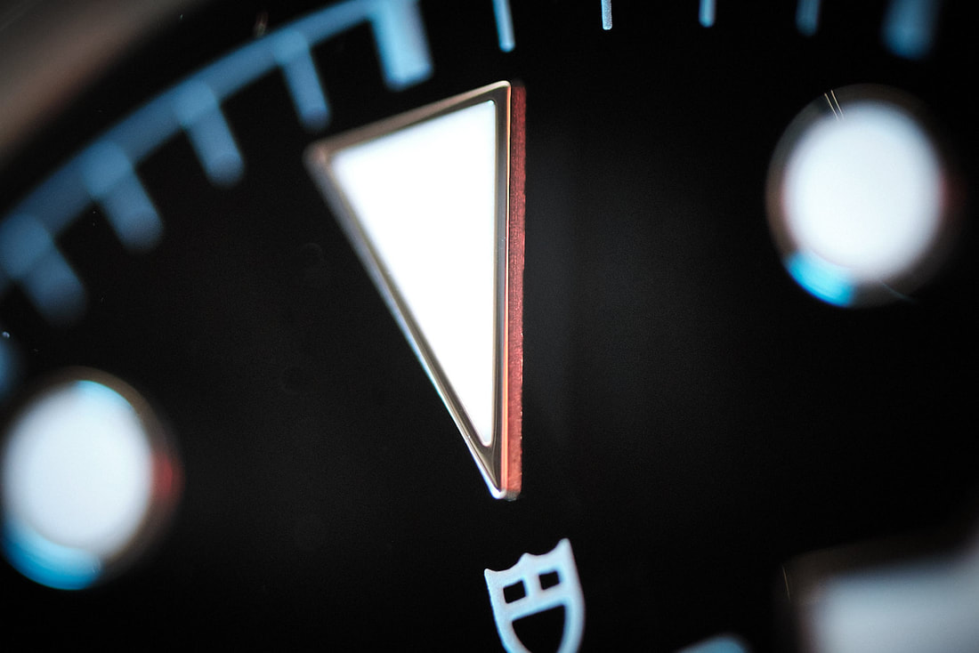
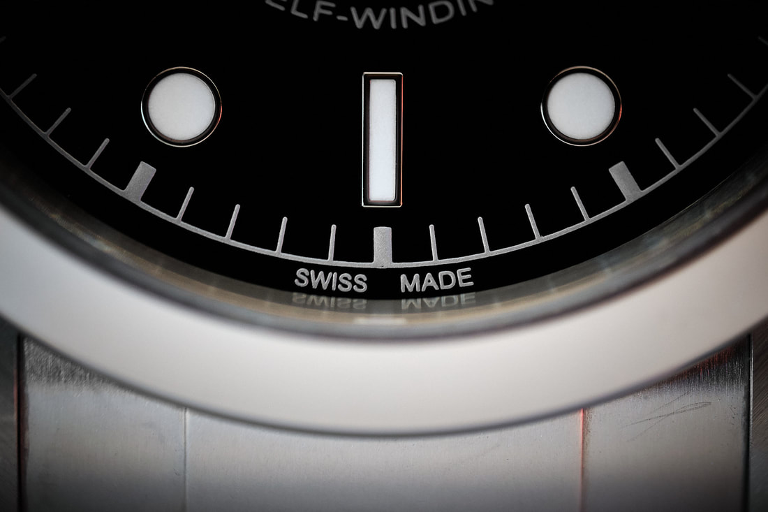
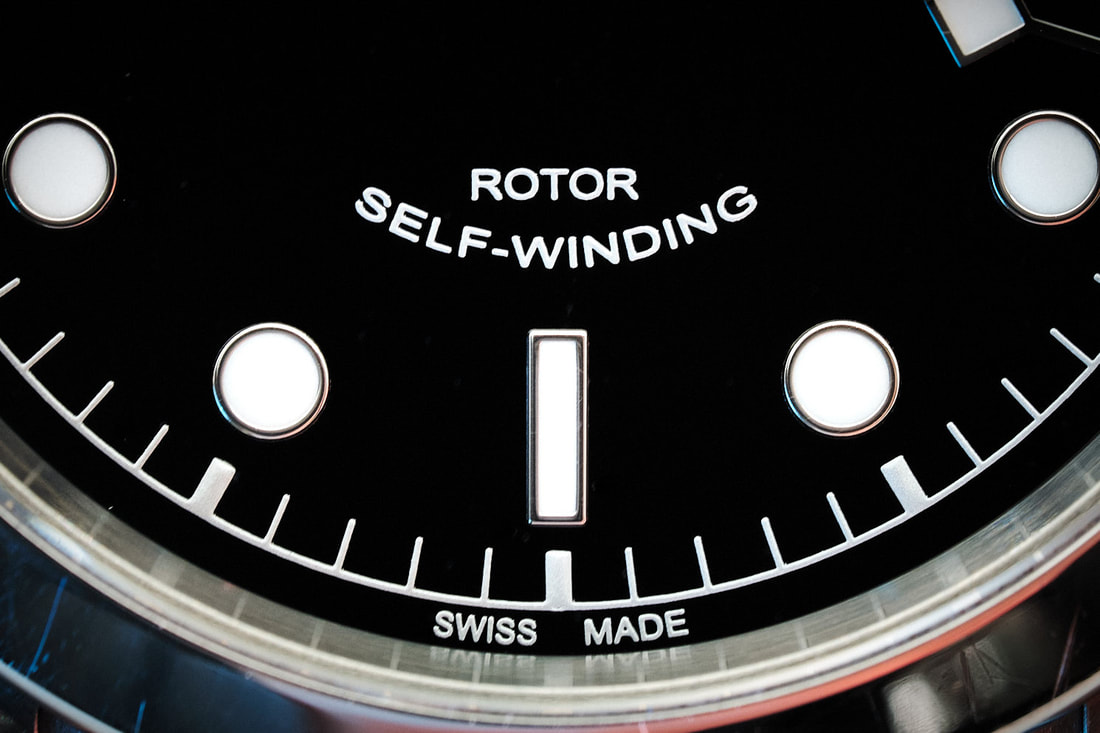
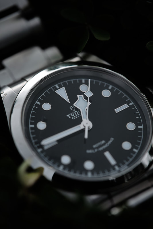
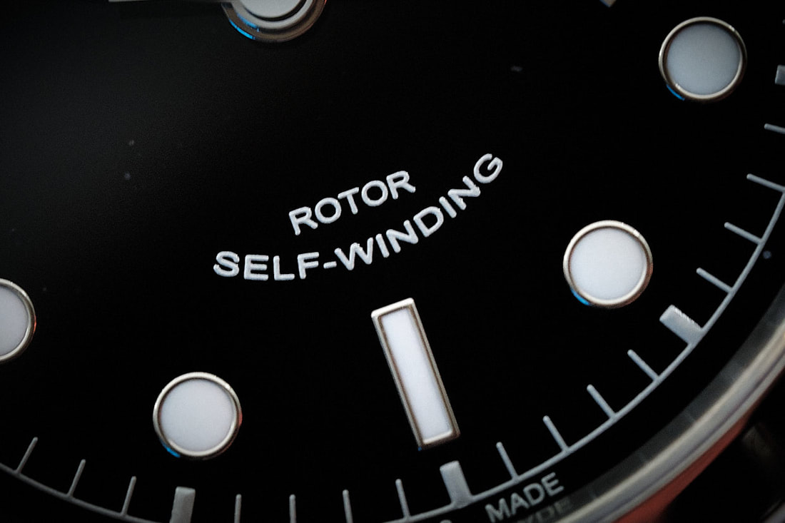
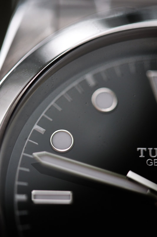
The dial is a stunner. This is possibly my ideal dial design. No numbers, no dates, just a clean and modern design with some excellent small details. I bought the black dial which is my favourite, but apparently the blue is the most sought after. Indices are all applied and hold up to loupe inspection, the combination of circles, bars and the large triangular 12 works so well.
The indices are crisp and clear with plenty of lume in the steel frame. The Tudor logo and brand name is printed crisply on the dial and looks great without being overbearing. The only other bit of print, other than the discrete minute markers, is the rotor and ‘smiling’ self-winding design. A literal smile on the dial. |
|
|
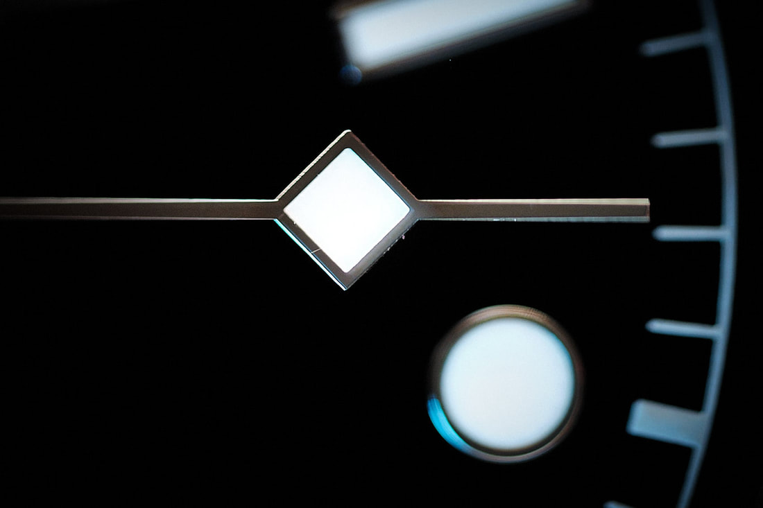
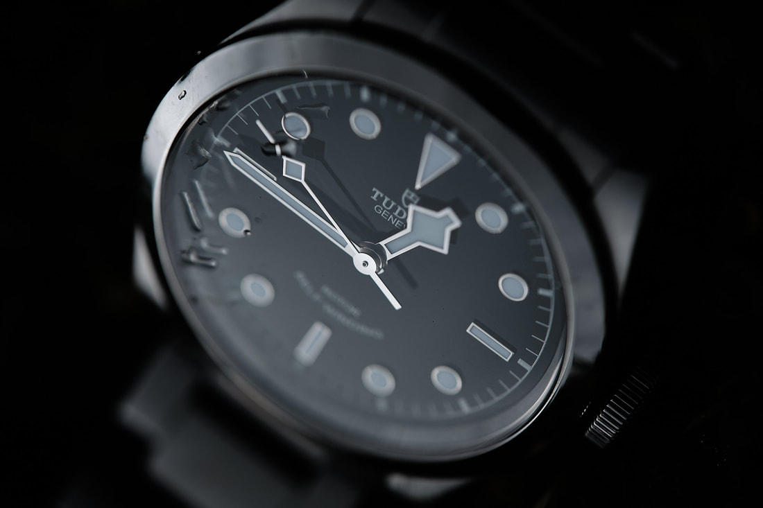
The hands on the dial brings so much more Tudor character here. I absolutely love the snowflakes on the hour and seconds hand. Glancing at the dial it’s super easy to identify what time it is and the fact that an offset square can bring so much visual interest to this watch is testament to its timeless design. There is no counterweight on the seconds hand, I think this is wise since we already have so many unique details on this lovely face.
|
|
|
It’s hard to find information on anti-reflective coating here but as far as I can tell from my research, there is AR applied to the crystal. That said, it’s not great so you will pickup a lot of reflections. Not the end of the world, but worth being aware of.
As mentioned, this is not a dive watch like the original Black Bay but rather an adapted design. This means we have a polished, very shiny bezel here which of course means scratch magnet. I’d say this is almost unavoidable, but I quite like the fact that buying second hand means somebody has already started the process. Sounds silly perhaps, but I don’t want to be the first to add a scratch. I’d like to linger on this since it reminds me of a Steve Jobs iPod story. I remember reading an interview with him where he mentioned the original iPod’s aluminum back. He expressed disappointment that people covered it up since natural hairline scratches was something he genuinely appreciated! He said, ‘why would you cover up an object we have literally spent years creating, with an ugly piece of silicon?’. |
|
|
Used steel & scratches can tell a story. Much like wrinkles on a face, it’s a tell of a life lived. I’d like to think that I’ll add my own to this watch and have my grandkids appreciate the aesthetics of a watch well worn. Keeping a watch in pristine condition is really only important if you intend to sell it imminently and is that really why you’d buy a beautiful piece like this? Let’s hope I don’t have to eat my words.
|
|
|
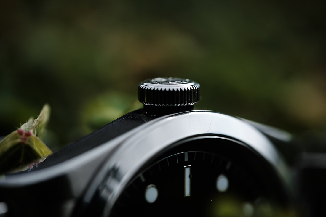
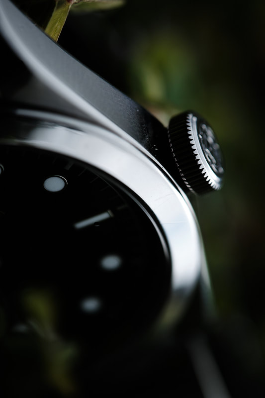
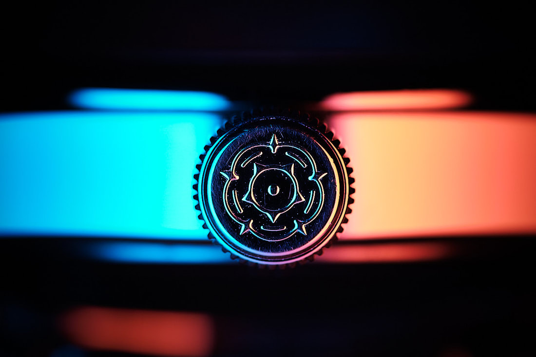
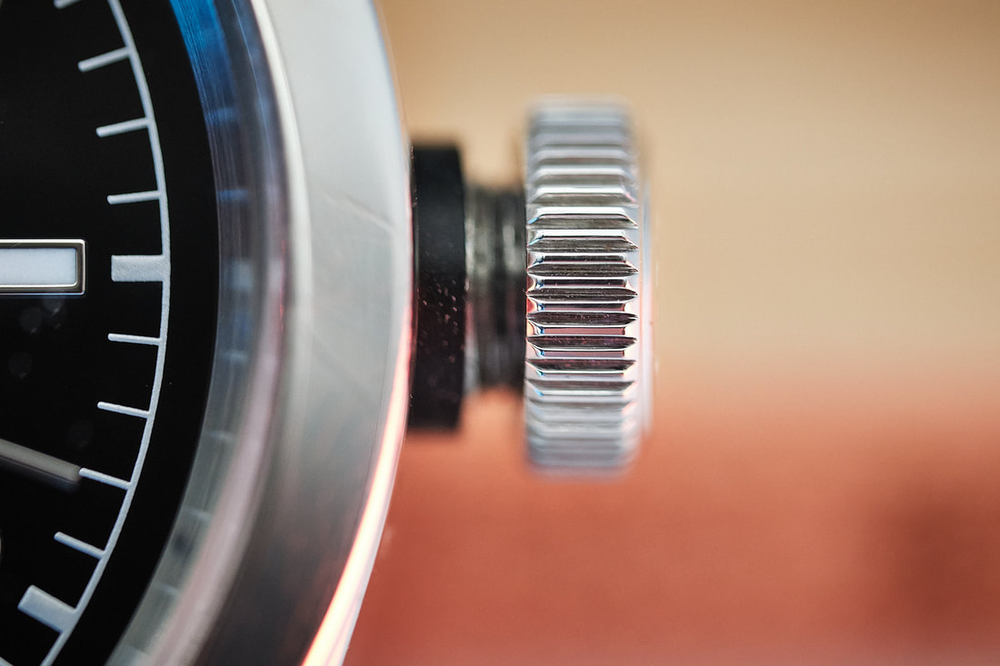
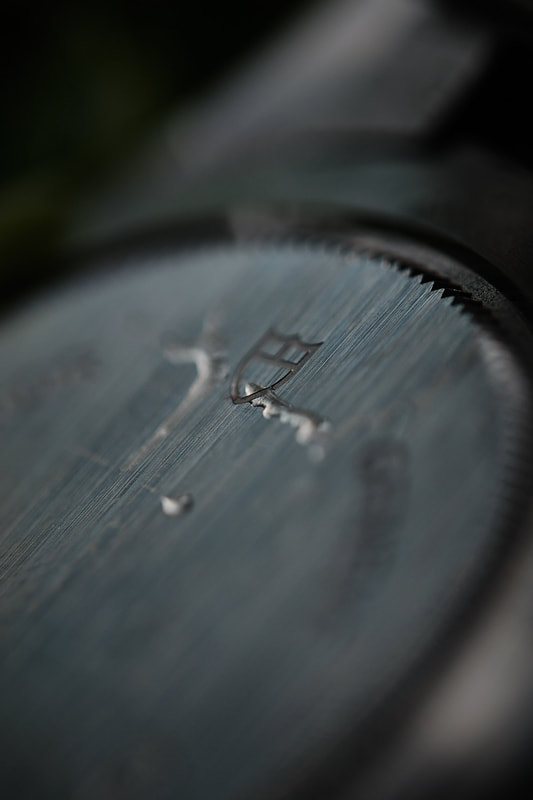
Moving on to this beautiful screw-in crown. It’s large, flat and easy to manipulate. There are no crown guards here, but you’ll see (just) a black tube that protects the crown and stem from being damaged. But, the most important thing here is a stunning engraving in the crown, the Tudor rose. It’s such a lovely touch. At a casual glance, it’s just a bit of texture but under the macro lens or loupe, you can really appreciate the work that’s gone in to the design and application. I adore this detail.
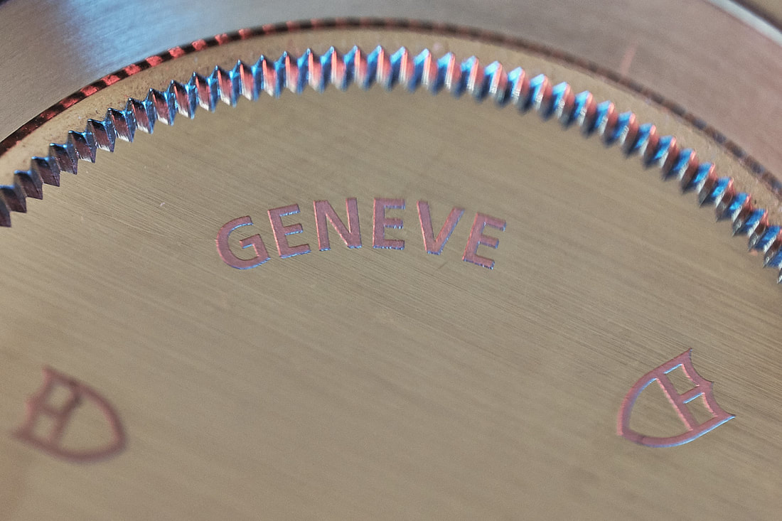
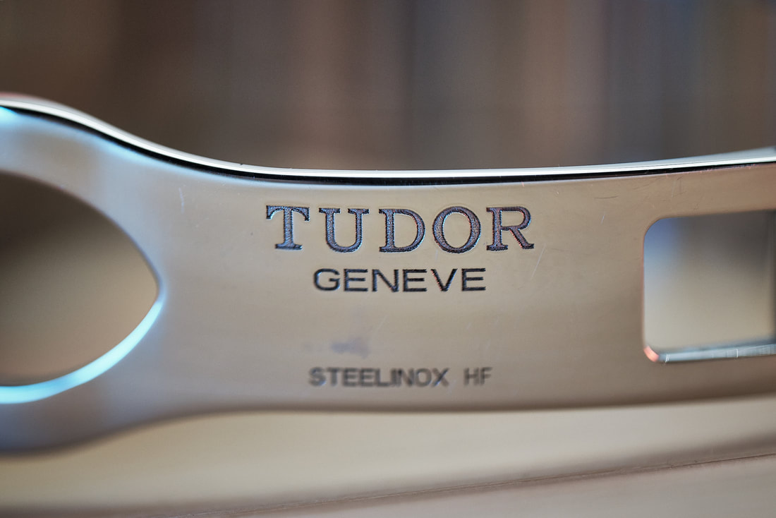
The back of the watch is plain like a Rolex. Clearly made to be engraved with only a few brand names and Tudor logos visible. Again, the whole back is soft and curved, very comfortable on the skin. |
|
|
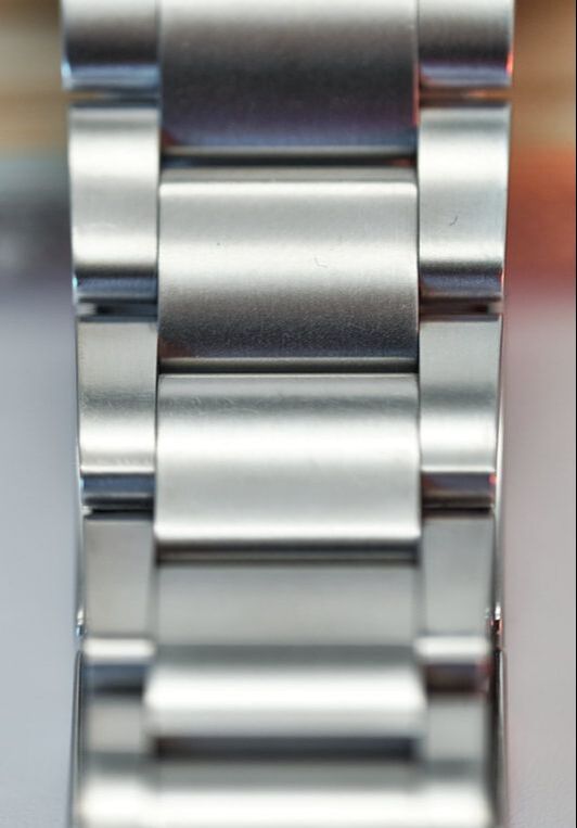
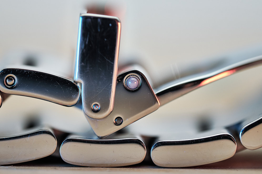
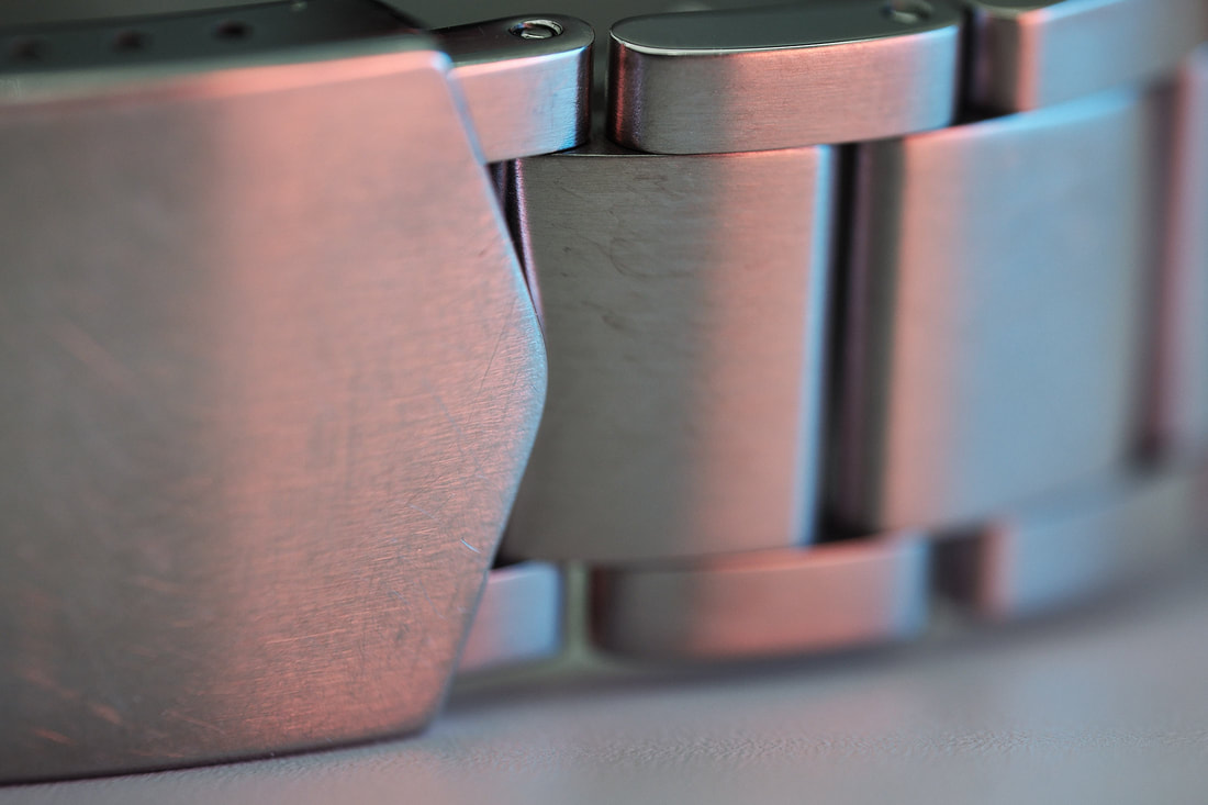
On to this awesome bracelet. Simply expressed, it’s a steel bracelet with a satin finish, a folding clasp with a safety catch. That does not tell the whole story here. There is weight in this bracelet, it feels incredibly well made since quite simply, it is.
Screw in links means it’s easy to adjust with a couple of half links and a three-step micro adjust in the buckle, I had no issues adjusting it to fit perfectly. The end links are solid and nicely rounded both at the top and underneath. I’m not a huge bracelet guy but I love this so much, it’s not come off yet. The solid clasp is stamped with the Tudor logo and is just as soft and well-made as the rest of the bracelet. The real treat here is how the buckle closes, so tactile and solid with a safety clasp that feels just as satisfying, achieved with a couple of ceramic ball bearings according to reports. When the mechanism is closed, it forms the Tudor shield, looks great and the buckle and clasp is surprisingly thin so wearing the watch whilst typing for instance, is no problem. Most of my watches eventually end up on an Erika strap. This might be the first one that stays on steel. |
|

|
Movement
Strap & Bracelet
Case
miscellaneous
|
|
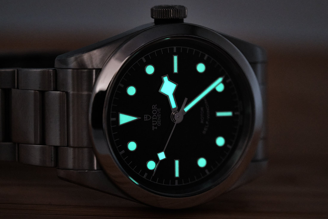
Finally, the lume. It’s brilliant. When fully charged, it’s 'Seiko good' in it’s bright green lume. It also lasts easily all night, so it’s clearly applied generously. The shape of the indices here makes it clear which way is up immediately. The blueish green is nice but I wonder if an ice blue lume like the Pelagos would have looked better? That’s a matter of personal preference and the fact remains, it’s strong, well applied and you’ll have no problems seeing it if waking up during the night.
|
|
Final Words
|
My first luxury watch and my first Tudor. I couldn’t be happier with my purchase and I truly hope that I never get the itch to move this on. In fact, I sold all my other dressier watches since I genuinely feel that for the money, I can’t do much better.
It’s a BlackBay Tudor but it flies under the radar unlike its more visible dive watch siblings and it’s definitely more discrete than wearing a Rolex OP/Explorer. Having handled both of those watches, I feel that this offers as much quality in both the case and bracelet. |
19 cm wrist
|
|
Obviously, this is a fairly standard ETA movement but the benefits here is that it won’t cost too much to service and any good watch maker can do so. I won’t have to send the watch in to Tudor and be totally exposed to whatever they might charge. Would I have preferred an inhouse movement with a longer power reserve and potentially thicker case? No, I can honestly say that I would not.
This is the perfect all in one watch for me and long term ownership should not equal an endless money pit. The Tudor is to me the classy, easy going brunette sister to the high maintenance trophy wife/husband Rolex. I couldn’t recommend it enough. Cheers, Esbjorn |
|
Did you enjoy this review? Coffee fuels my night time ponderings.